Why Web Accessibility Matters

Did you know that search engines rank websites better if they are created according to best practices for providing accessibility for those affected by disabilities?
Google and other major search engines are promoting and increasing visibility for those sites that take into account web accessibility techniques.
Access to the internet is now a human right, and Google is making sure that site owners pay more attention to it.
If you are wondering how your site is ranking for this.
- Google has a tool called Lighthouse, which is an open-source tool for web developers that provides tips and the score in this area. Provide Lighthouse with a URL for the audit, and it will analyze your site across several categories, including accessibility. The test will show how user-friendly your site is for people with disabilities and will provide a list of things that can be improved. By clicking on each category in the report, you can get more detailed guidance (for example: “Contrast: Background and foreground colors do not have a sufficient color ratio.”).
On Lighthouse, you can see more ways to improve your accessibility score. At the Carnegie Museums of Pittsburgh website, you’ll find comprehensive guidelines for designing a website that is more accessible for people with vison and hearing disabilities. It advises on code, design, and content writing. It also provides links to helpful tools and resources.
Key Tips for Accessible Web Design
We gleaned four quick tips from a presentation by Nonprofit RespectAbility’s Communications Vice President Lauren Appelbaum and Communications Associate Eric Ascher:
1. Understand and include alternative text.
Alternative text, known as “alt text” (it is written in html as alt=‘icon’), is a phrase that can be included as an attribute on any website. It explains what is shown in a graphic. It should be very clear to allow a reader or listener to comprehend all the information in the image. You can include in alt text the image’s content and any other related information that you think is helpful. Take into consideration that some accessibility devices cannot read more than 100 characters, so be as concise as possible. Social media posts should contain image descriptions, which serve the same purpose as alt text.
2. Color is hard for some people.
When starting a business, you need to consider this aspect in your branding. If you already have branding colors set for your business, we know that it will not be easy for you to change them; however, there are some other things that you can do on your website and social media posts: use contrasting colors (that is, try to avoid low contrast between colors), place different-colored outlines or borders around text, use dark text on light backgrounds and light text on dark backgrounds, and make colors in your graphic very different from each other.
3. Describe thoroughly.
Links within text copy and fields on fill-in-the-blank forms like “Contact Us” forms should contain clear descriptions. Links brings you better results if you link to a meaningful phrase inside the paragraph instead of to a “click here” after a sentence. Each blank on a form should be labeled, ideally to the right of checkboxes and to the left or directly above other form fields in a left-to-right language like English.
4. Make media inclusive.
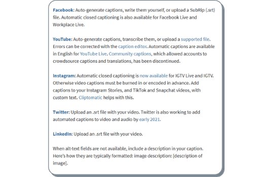
It is important to provide the option of a synchronized alternative on video and audio posted on a website, such as captions or an ASL interpreter. Social media videos are often watched without sound on; even people with full hearing ability do this. Therefore, captions are necessary, as they provide all the information that sound otherwise would. Captions and subtitles are not the same: subtitles only repeat what’s being spoken, and captions also include written depictions of other sounds including sounds in the environment such as applause or music. The good thing about uploading videos on YouTube is that people can activate the captions, an essential for people with hearing disabilities.
4.1 Why are captions and transcripts important for media?
Transcripts give you a written version of the audio. It is convenient for people who have hearing disabilities or prefer reading. Captions not only increase accessibility, they also improve user experience for everyone.
4.2 How can I make my social media content more accessible?
Learn how to add alt text on Twitter, Instagram, and Facebook, as well as how to take advantage of YouTube’s live captions as a source for captioning.
Katie Sehl from hootsuite provides some important clues for creating accessible channels:
- Make text accessible: Write in plain language, and don’t overuse caps. Use camel case for multiword hashtags. Example of camel case: #MakeYourWebsiteAccessible instead of #makeyourwebsiteaccessible. Camel case breaks long hashtags into readable word chunks, making them easier for people with low vision. It also helps screen readers pronounce each word correctly. Put hashtags and mentions at the end. Use an adequate font size, large enough to be easily readable (body text is usually recommended at 16px or larger, headings should be proportionally larger to create a clear hierarchy, and the font should scale well on mobile devices).
- Provide descriptive image captions: Convey the content. Skip saying “image of” or “photograph of.” Share humor.
- Include video captions: This is crucial for viewers with hearing impairments, as they cannot rely on audio alone, and captions give them access to the information.

Does website accessibility matter for AI-driven search engines?
Yes, accessibility plays a growing role in ensuring discoverability. AI tools are only in the development stage now, but they influence how we search and find information online. The more accessible your website is, the higher it is ranked by AI searches. Best practices like proper alt text, clear link descriptions, semantic HTML, and captioned media provide AI systems with more interpretable data. This improves how AI search engines process and rank content.
In the end, we would like to encourage you on your journey toward increasing your website’s convenience for people with different levels of ability. It’s a win-win: More people will be able to enjoy your content comfortably, and search engines will notice that too. Meeting the standards is great, but it is not only that. Showing that you care about every person who visits your website is much more valuable. Start with small steps and keep improving over time instead of trying to achieve everything at once. Remember that every step contributes to a kinder, more inclusive, and more ethical digital world.

